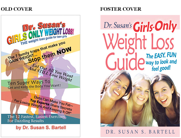
OLD COVER Colorful, but confusing. The first subtitle you see says “stop them NOW”. Stop who, the dancers? Resist using too many subtitles, or at least organize them so they don’t create a mess.
FOSTER COVER: We’re targeting teens and parents so let’s be dignified and trustworthy, yet playful and energetic. Red, pink and teal all score a high response from females. Let’s keep the white background for its clinical, trustworthy feel. The girls share a healthy look and attitude, reinforcing the title and subtitle. We do not show their entire figures because an attractive face looking at you is better at grabbing attention. The author’s name is dignified in a serif typeface, reflecting her expert status.
FOSTER COVER: We’re targeting teens and parents so let’s be dignified and trustworthy, yet playful and energetic. Red, pink and teal all score a high response from females. Let’s keep the white background for its clinical, trustworthy feel. The girls share a healthy look and attitude, reinforcing the title and subtitle. We do not show their entire figures because an attractive face looking at you is better at grabbing attention. The author’s name is dignified in a serif typeface, reflecting her expert status.
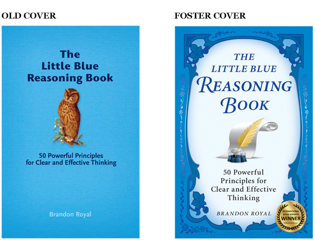
OLD COVER: A wise owl can decently accompany the title with a wink but, beyond that, this cover is half-baked.
FOSTER COVER: Using a classic style conveys a solid, time-tested credibility behind the content. One can imagine great minds of the past using the 50 powerful principles promised in the subtitle. This template served very well for a series of educational books on various topics.
FOSTER COVER: Using a classic style conveys a solid, time-tested credibility behind the content. One can imagine great minds of the past using the 50 powerful principles promised in the subtitle. This template served very well for a series of educational books on various topics.
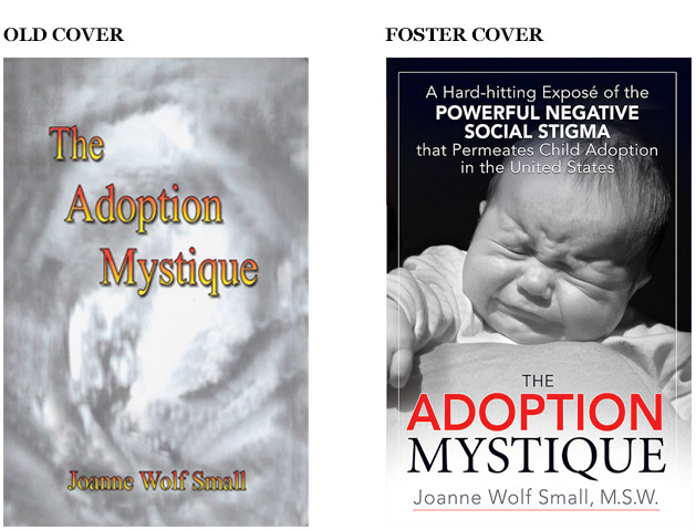
OLD COVER: This is a researched collection of essays and studies elucidating the social stigma about adoption in the United States, aimed at educated adults and policy makers. Instead, the first cover looks like a sci-fi novel.
FOSTER COVER: For starters, let’s add a subtitle. Placed at the top, relating to the infant, you can read it’s most important words (in bold capitals) from across the room. A black-and-white photo with a strong light source increases drama. Red and black are used effectively to evoke alarm in this context. Combined with the infant, you instantly know this an expose of adoption’s “other side”.
FOSTER COVER: For starters, let’s add a subtitle. Placed at the top, relating to the infant, you can read it’s most important words (in bold capitals) from across the room. A black-and-white photo with a strong light source increases drama. Red and black are used effectively to evoke alarm in this context. Combined with the infant, you instantly know this an expose of adoption’s “other side”.
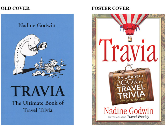
OLD COVER: The perfect example of a concept that may sound okay when you describe it but does not work visually. The airliner peering through a magnifying glass at artifacts? Sorry. This is a fish at a yard sale. A concept is no good without successful execution. Also, the black type does not stand out enough from the background. It is very easy to ignore this book.
FOSTER COVER: Combining travel and trivia makes a cute word for a title but because it’s meaning is not too clear, the subtitle must be very easy to see. The suitcase says “travel” and the balloon grabs attention. The color blend inside the title rises with the balloon, and even the typeface itself stretches upward. Tilting the suitcase gives motion and helps convey the books light, entertaining tone. The border (an old map requested by the publisher) adds action by allowing the balloon to escape it.
FOSTER COVER: Combining travel and trivia makes a cute word for a title but because it’s meaning is not too clear, the subtitle must be very easy to see. The suitcase says “travel” and the balloon grabs attention. The color blend inside the title rises with the balloon, and even the typeface itself stretches upward. Tilting the suitcase gives motion and helps convey the books light, entertaining tone. The border (an old map requested by the publisher) adds action by allowing the balloon to escape it.
OLD COVER: All-type covers can be great, but not this time. The title disappears too much. The subtitle does not contrast enough against the background. The author's name does not warrant all that space. This is a case when a concept (the radiating light) does not execute well. It is very easy to glance past this cover.
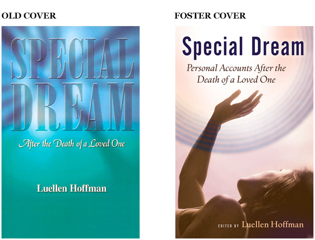
FOSTER COVER: Let's include a human here and, for heaven's sake, make it dramatic. These are true stories of a unique, life-changing, spiritual moment. The intensity comes through in this design. You can get it in an instant, even from across the room.
FOSTER COVER: Let's include a human here and, for heaven's sake, make it dramatic. These are true stories of a unique, life-changing, spiritual moment. The intensity comes through in this design. You can get it in an instant, even from across the room.
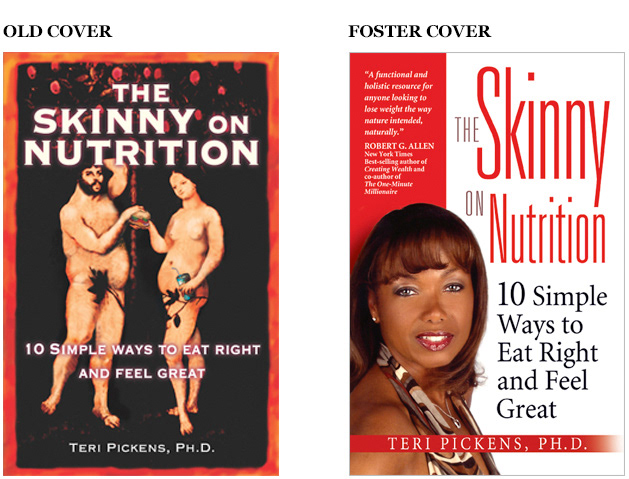
OLD COVER: Does the first cover look skinny to you? Eve is handing a hamburger to Adam, holding a can of soda, and they’re both overweight. It’s cute, but do you believe you’ll lose weight here? Instead, you expect jokes and stories about overweight people. Be very careful with irony. It can work against you.
FOSTER COVER: Fortunately, the author looks great. Let’s put her on the front cover. An attractive face always grabs attention, plus we can show that she lives what she teaches. Red gets a strong positive response from women, and white is clinical, trustworthy. Skinny letters are used in the title, and the two important words are enlarged. The layout is anchored on the left and flows to the right to add action and vitality.
FOSTER COVER: Fortunately, the author looks great. Let’s put her on the front cover. An attractive face always grabs attention, plus we can show that she lives what she teaches. Red gets a strong positive response from women, and white is clinical, trustworthy. Skinny letters are used in the title, and the two important words are enlarged. The layout is anchored on the left and flows to the right to add action and vitality.
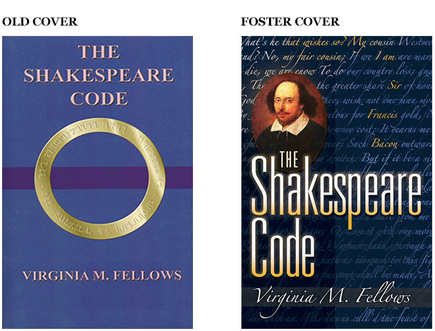
OLD COVER: The book supports the theory that William Shakespeare was actually Sir Francis Bacon. The coded ring is dignified and mysterious, but looks like an awkward Lord of the Rings imitation.
FOSTER COVER: Text from Shakepseare’s “Henry V” fills the cover and the upper right corner shows the embedded words, “I am Sir Francis Bacon”. Strong contrast makes the title jump. The face helps attract those most likely to buy a book on this topic.
FOSTER COVER: Text from Shakepseare’s “Henry V” fills the cover and the upper right corner shows the embedded words, “I am Sir Francis Bacon”. Strong contrast makes the title jump. The face helps attract those most likely to buy a book on this topic.
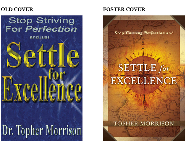
OLD COVER: I never thought I’d see a book cover with the title too big but this is just plain cramped. Compressing the title and adding such an overpowering shiny effect hurts legibility. Overall, it feels like an ad for cheap jewelry.
FOSTER COVER: The author compares success to a travel adventure and desired an old map so my real task was execution of the concept. The warm monotone color scheme, borders and frame corners create the right flavor. Brighter color in the center draws your eye to the title. Centering all the text gives a traditional, reliable feel. We embossed the title and printed a percentage of metallic gold overall to enrich the perception of quality, or excellence.
FOSTER COVER: The author compares success to a travel adventure and desired an old map so my real task was execution of the concept. The warm monotone color scheme, borders and frame corners create the right flavor. Brighter color in the center draws your eye to the title. Centering all the text gives a traditional, reliable feel. We embossed the title and printed a percentage of metallic gold overall to enrich the perception of quality, or excellence.
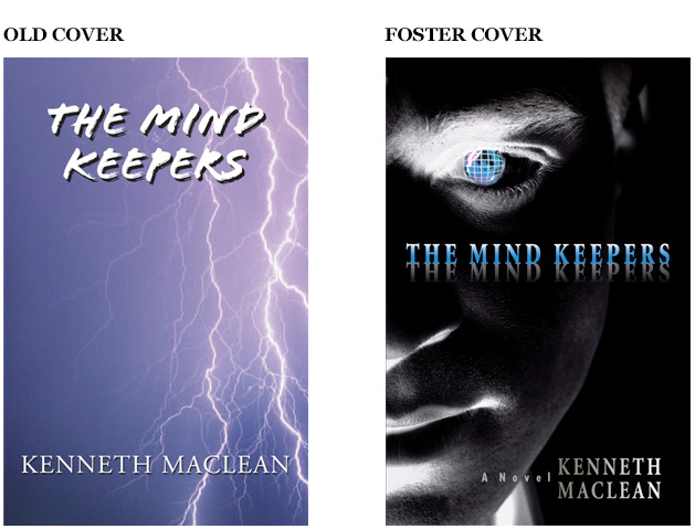
OLD COVER: The book is a thriller about state-sponsored microwave technology for long-distance mind control that turns ugly in the wrong hands. Lightning is not specific here. It was a dark and stormy night?
FOSTER COVER: The face is switched to negative for a disturbed reality. Combined with the seriousness of the face we have drama, mystery and a tech feel. Only the eye and title are colored. This emphasizes the starkness to evoke your vulnerability. The title looks like it is catching light from the eye which adds intensity to both as they are communicating to each other across the void.
FOSTER COVER: The face is switched to negative for a disturbed reality. Combined with the seriousness of the face we have drama, mystery and a tech feel. Only the eye and title are colored. This emphasizes the starkness to evoke your vulnerability. The title looks like it is catching light from the eye which adds intensity to both as they are communicating to each other across the void.
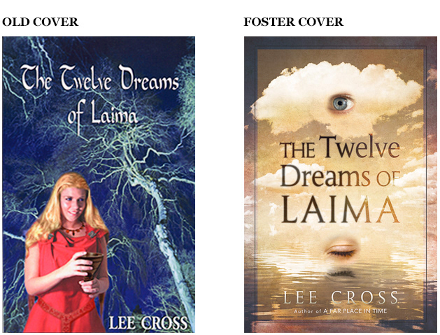
OLD COVER: A man meets Laima who helps him discover his past lives which is enjoyable and until he can’t get rid of them. The joys, terrors, wisdom and confusion of living them again in dreams that last for days ultimately leads to a surprise ending. It’s a man’s story, but men were ignoring this book. No wonder — this looks like a wicken manual for girls.
FOSTER COVER: The floating eyes evoke dreaming visions. They promise fantasy and mysticism in a gender neutral color but with male eyes. The dominant color is sepia, the color of very old photographs, to evoke past times remembered.
FOSTER COVER: The floating eyes evoke dreaming visions. They promise fantasy and mysticism in a gender neutral color but with male eyes. The dominant color is sepia, the color of very old photographs, to evoke past times remembered.